
A form that is identical to another except that it is reversed, as if viewed in a mirror
--------------------------------------------------------------------------------------------------------------------------
Pause Dream Enjoy - Challenge #35, You're so tweet
--------------------------------------------------------------------------------------------------------------------------
Pause Dream Enjoy - Challenge #35, You're so tweet
Artist Playroom - pick your favorite color
Unique Crafters Challenge blog - September, Anything Goes
Recycle, Re-Purpose & Reinvent - Anything Goes
Just getting under the wire for one of my challenges, whew! I loved picking my favorite colors to create with, I am a pastel girl, any color that's soft and dreamy is the color for me.

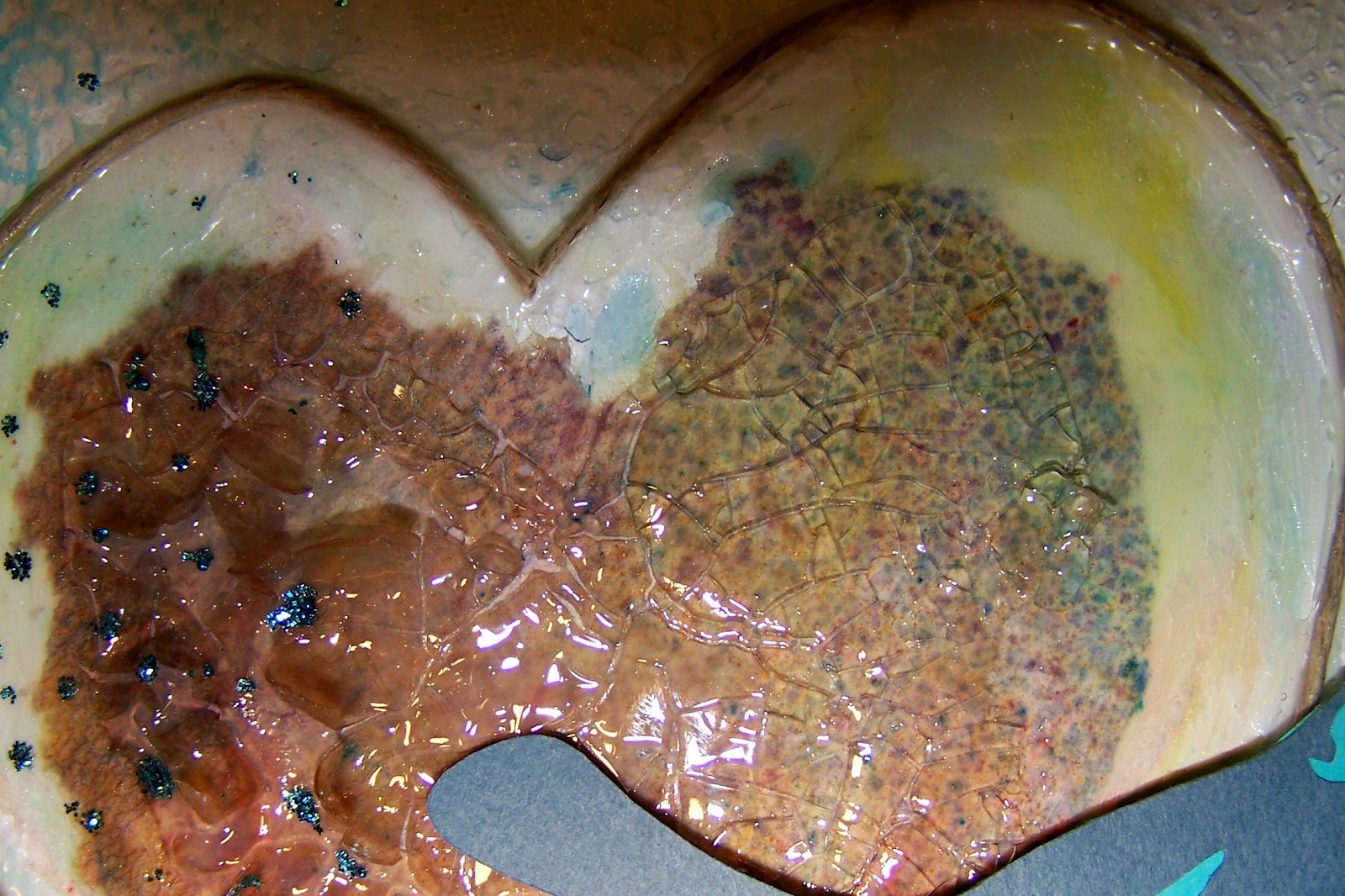
I cut my bird and branch from the Cricut French Manor cartridge. The brown paper ( heart ) is recycled wax paper that came from the bottom of my spray box! I love all the little speckles from the sprays on it, this photo really doesn't show it very well.Recycle, Re-Purpose & Reinvent - Anything Goes
Just getting under the wire for one of my challenges, whew! I loved picking my favorite colors to create with, I am a pastel girl, any color that's soft and dreamy is the color for me.

Prima - flower
Ranger - stickles


26 comments:
Fantastic piece Sandy :D Loving everything about it and I really love that sentiment and the way it was applied. I may have a go at the tutorial for it so thank you for the link.
I'm don't have a clue about edging, sorry. Have a wonderful day :0)
Hi Sandee, it would be ink the edges in soft brown every time for me, less structured that way and would give a more blended appearance. This is fabulous and I can certainly see the Donna D inspiration in it. Love that technique with the waxed paper sentiment too, must have a go at that. Really fabulous.....Crafty hugs, Anne x
this is just so pretty! love the blue colors
Gorgeous! This is really artistic. I love it. Thanks for playing with us at Pause Dream Enjoy Challenges. :) Janis
I love your beautiful textural heart Sandee - it really is stunning and if you hadn't mentioned the lifting bit then the rest of us wouldn't have known! Makes no difference because the whole thing is gorgeously soft and dreamy.
The inking? Mmmm. . . not sure. . . because your text is in black I would normally say use black but the colours of your background would look best with brown (perhaps like a walnut stain type colour). I'd go for brown.
Juliaxx
I love this! I need to go check out the wax paper tutorial!
I'm not sure about black or brown. I really like both! So I think its a matter of personal preference.
This is a fabulous entry - and look at all those challenges you met with just one project! I love the soft colors and the sentiment - beautiful tag.
Love the texture!, (i'd go with soft brown)
It's perfect just the way it is, I wouldn't add anything. That heart is so fantastic and the soft colours are beautiful. Thanks for the tip on the words, must try that.
Von
Pinterest is like the black vortex of time thieves... I think I will have a little scan and three hours later I realise I haven't moved and my eyes go all blurry... now of course I need to go and check out that tutorial... so I will see you in a couple of hours!!!!! love the effect though so it will be worth it...xx
Stunning sign you've made and sounds like a lot of fun, great recycling too! =) I think I would go for soft brown! =)
Thanks for joining us at our Recycle, Re-Purpose & Re-Invent challenge!
Hugs, Elenor DT
This is a wonderful post, Sandee, and while I'm still a virgin regarding pinterest, I am almost tempted to check out the wax paper transfer... I'd never thought of that, but it sure looks great.
As for your question, I don't know. I like what you have and I'd probably like it with either black or brown. I'm glad others could BE more help with that!
Thanks so much for visiting me, too.
I love your pastel rainbow of colors!
I'd go with the soft brown. You can always go darker if you think it needs it, but you can't go lighter. ;)
You always achieve so much texture and dimension in your pieces! Very tweet! (Couldn't resist, lol)
A beautiful piece of art, Sandee! Thanks for the link. As for the inking, as the majority of your piece is soft pastels, I'd go with a soft brown...you can always darken it if you need to.
Really lovely. I love the colors and think maybe a soft brown on the edges. Thanks for showing the layers and pieces.
wow! lots of steps! and it's worth every one to get something this beautiful! i love the colors - normally i like brighter - but this looks right. and i love the prayer - never heard that one but it is perfect!
pinterest, the time sucker of all time suckers. SO fun though.Love this piece. colorful yet soft. Beautifully rendered.
Best,
Jenn
What a clever bunny you are to tick all those challenge boxes in one go Sandee...oh how I wish I could do that!
Pastels seem so right for you and this piece is perfect as is the sentiment.
I've not really got into Pinterest yet and have to admit I fear it...I struggle so much with my time as it is! ;D
Have a great weekend whatever you're planning ~ enjoy :D
xoxo
This is awesome! I love your sentiment and how you made the heart is very cool! :)
Hi Sandee,
Can you tell I'm trying to catch up with my blog visits? I'd choose the brown for the edges of the canvas. It's quite beautiful.
The wax paper effect is interesting. I'm going to have to think about the text thing though.... yep, blonde.
Hugs,
Kay
I like this piece just the way it is. When you talked about the brown paper, I thought you were referring to the branch and kept looking for the shiny paint. Go figure I'm SO literal at times.
I would LOVE to see that wax paper transfer technique before I create my transfers post.
It is a beautiful piece and WOW, so much technique here! I'm amazed at all your terrific creative know-how's!
So soft and pretty - love the paint and gesso with the doily - just lovely! So glad you linked up at RRR!
Sandee, Love the effect on the wax paper and so glad that you explained how you did this. Such a cool think to know. Thank you for sharing this on Art With No Boundaries.
:) Chris / CS Designs
Post a Comment