Showing posts with label Tim Holtz 2013 tags. Show all posts

Monday, August 12, 2013

Umami: noun

a taste sensation that is meaty or savory and is produced by several amino acids and nucleotides

pronunciation

( Food Words Worth Savoring )

-----------------------------------------------------------------------------------------------------------------
Hope you enjoy the video on the wax paper transfer technique, I'm still learning and experimenting so have a lenient heart while watching :)

what I learned this time:
1. Don't talk too much while you have something that needs to applied quickly, lol


my version of the August 2013 TH tag as a 6 x 12" wall hanging:

I was able to use a masking technique using post it notes to cover my image. I used the same techniques as TH did for the background ( it happens to be the way I do all my almost all of my backgrounds so that worked out easily enough. )

Ranger - Distress Stains, vintage photo,brushed pewter, black soot
Inque Boutique - tread stamp
Reminisce - sticker letters
Primo - charcoal pencil
Golden - Gel Matte, Archival Varnish ( for inks and stains )
Spectra Fix - pastel fixative ( for charcoal pencil )

Wednesday, July 31, 2013

Tomfoolery: noun

playful or foolish behavior

-----------------------------------------------------------

12 tags of 2013 – july…

Ranger Products
Distress stains - barn door, broken china
Distress stains - barn door, vintage photo 
( I did purchase the brushed pewter stain, but discovered too late that it does not show up on top of the darker red, but it does add a nice shimmer )
Ideology - grunge paper, tissue tape,word bands
Distress Crackle Paint


OK, so totally veered off course on this one, but I had fun :) and that's what matters!
I am hoping that what matters is trying a new technique and checking out a new product, if that is the case, then I have been successful, even if my wall hanging does not resemble his tag.
( It's also pouring down rain, so the picture is affected, will take another one to replace this as soon as I get a little sunshine, I'm just trying to make the deadline as I am squeaking in here.)

I did try the red, white and blue streaked background with the brayer, but did not like how mine turned out so I used a stencil and modeling paste to create a layer, then covered it with distress stain hoping to soften the red and blue. Didn't like that either so I uses a layer of tissue paper over it.

I did manage to keep 2 elements in the piece, the open cut chipboard at the top and a border element on the bottom. It was the first time I have ever inked over the crackling, so I did manage to learn something new, and that's what is important, right? ( nod head yes please )

other products:
Faber Castell - Big Brush pen
Cricut - Paper Trimmings p. 36
Golden - gel medium, molding paste
Crafters Workshop - TCW97, TCW201S

also entering this in:
Creative Inspirations: Inspired by anything goes


Sunday, June 23, 2013

ransack: verb

to search thoroughly
 
 to examine closely and carefully
 
 to search through to commit robbery
 
 to search through in a way that causes disorder or damage

pronunciation
-----------------------------------------------------------------------------------------------------------------------
I combined the Tim Holtz- June 2013 tag

Ranger products:
Distress paints, distress stains, alcohol inks

along with
Tracy used:
You have many reasons to smile
We are all in this together
You are amazing just the way you are
Life isn't perfect, but it's pretty darn good

I just love the turquoise, lime and pink colors in this piece.
I just couldn't muddy it up with brown ink.

The backgrounds were created with my Gelli Plate. The small background piece was run through my embossing machine with the leaf stencil. It didn't show up as well as I hoped so I used some Distress stain to paint in the leaves a little so they would stand out better.

I accidentally discovered that if you apply sprays over the paint and then wipe off, they inks stick to the embossing paste beautifully. Really enjoyed that surprise. :)

The dragon fly is cut out of a shiny silver card stock so I used alcohol inks to cover the body first and then went back with the Twinkling H20's for some glimmer.
other products:
Cricut  - Art Nouveau cartridge, p. 54
Petaloo - flower
May Arts - vine ribbon
Helmar - 450
Gelli Plate
Sheena - embossing plate
Luminarte' - Twinkling H20's
Crafter's Workshop - art word stencil
Golden - Molding Paste
Higgins - waterproof ink

Friday, May 31, 2013

efflorescence: noun

 the action or process of developing and unfolding as if coming into flower
 an instance of such development 
 fullness of manifestation : culmination

 the period or state of flowering

the process or product of efflorescing chemically

-----------------------------------------------------------------------------------------------------------------------


 It started all fun and games, loved the first step with the ink/rub on resist technique. I've used that before and always have fun with that. Then it sat for about the whole month, hadn't a clue and frankly was quite bored with the whole piece...which usually gets me in trouble, and now is the part where I blame Ranger Inc. for doing the 16 days of Melt Art Mania....lol 
They brainwashed me...I got out my melt pot, heated it up and stared at the board....did some more staring at the melt pot.....and finally, my creative .....errrr....stupid other half took over. You know the one that gets us in trouble? I took the whole pot and poured it over the wall hanging, and had the brilliant ( not ) idea to use a credit card to spread out the wax....uh, credit cards are plastic..the melting pot melts plastic....what on earth was I thinking? 
It was OK for the first swipe and then my card melted and I got wax on my fingers and I yelped, did a little panic dance and flung wax everywhere....when it was over and I checked to make sure no body parts nor kitchen parts were damaged, I peeked at the piece and figured it was no more a mess than I had begun with, so I took it to the art room and used my heat gun and a METAL spatula to spread out the wax, inserting the word strips and hand into the wax itself so it does have a nice embedded look to it.
 Do I recommend this technique to anyone? 
Nope, it's like handing a pack of matches to a 5 year old and saying, 
"Now, don't burn the house down dear! "
so yeah....I definitely embraced imperfection :)
So how hard are you laughing right now?
Go ahead, I won't hold it against you.


Monday, April 8, 2013

equivocal: adjective


1.  subject to two or more interpretations and usually used to mislead or confuse
or
uncertain as an indication or sign
 
2.  of uncertain nature or classification
or
 of uncertain disposition toward a person or thing : undecided
also
 of doubtful advantage, genuineness, or moral rectitude

pronunciation
 
------------------------------------------------------------------------------------------------------------------------- 
entering this in:
 
Tim Holtz 12 tags of 2013
 
 
I didn't have to combine the 2 challenges but they did seem to walk hand in hand this time around. I also didn't have to use Ranger's sentiment that they used on the color prompt, but I thought it was grand and used it anyway, especially seeing that April 22nd is Earth Day
...and I am happy. See, doesn't take much for me.
 
Ranger products:
 
Dylusions, melted chocolate
Distress Paints, wild honey,forest moss,broken china,walnut stain
stickels, frosted lace
Idea-ology word band
Distress Marker, bundled sage
Distress Ink, antique linen
Idea-ology Tissue tape
 
  
other products:
 
Crafters Workshop stencil 261, 97
Cricut - Art Nouvea, p. 54
Creative Memories - Metallic marker
Golden - Molding Paste
Maya Road - chipboard letters
Lil Davis - chipboard corner
Helmar - 450
Close to my Heart - marker
----------------------------------------------------------------------------------------------------------------

On Saturday we had our Opening Reception for the 30 Day Challenge at the Art MoB. I think we had a good showing, lots of people showed up. This is the gallery side of the shop.
 
 Here are the artists ( including me ) who participated in the challenge.
 
I will admit to you, my bloggy friends that I try to stay away as far as possible during these functions. Nothing makes me more uncomfortable than being around people who want me to talk about my art, I start to ramble, I become this scatter brain blob talking about everything and nothing...lol So I stayed up at the corner of our street and handed out flyers about the event....and again I was happy.  


Tuesday, March 5, 2013

paltry: adjective

inferior, trashy
 
 mean, despicable
 
  trivial
 
meager, measly

 
--------------------------------------------------------------------------------------------------------------------------
( Click on the picture to take you to TH tutorial )
So here is my take on Tim Holtz's 12 Tags of 2013 as a 6x12" wall hanging.

The only question I have .... 
Is this feminine grunge?
 
I cut my label from the Cricut, French Manor cartridge, p. 54 at 7 x 4.361" ( took it to the Cricut Craft Room to remove the extra cuts so that I had one solid cut ), if I had the proper bunny silhouette cut I would have used the CCR to layer my cuts and would have been done, ( much like TH showed using the mover and shaker die and the bunny die ) but since I didn't; I had to print out and cut a clip art bunny shape, use a tiny bit of double sided tape to it and laid it on top of the label and then used my Fiskars Finger Tip knife to cut the image out. Inked the edges with Antique Linen ( but note to self, make sure mat is clean as other inks will transfer, which is why I have a rosy tint to outside edge of the label )...sigh

How many of you held your breath when applying the heat gun to your tinsel?
I know I did!
 
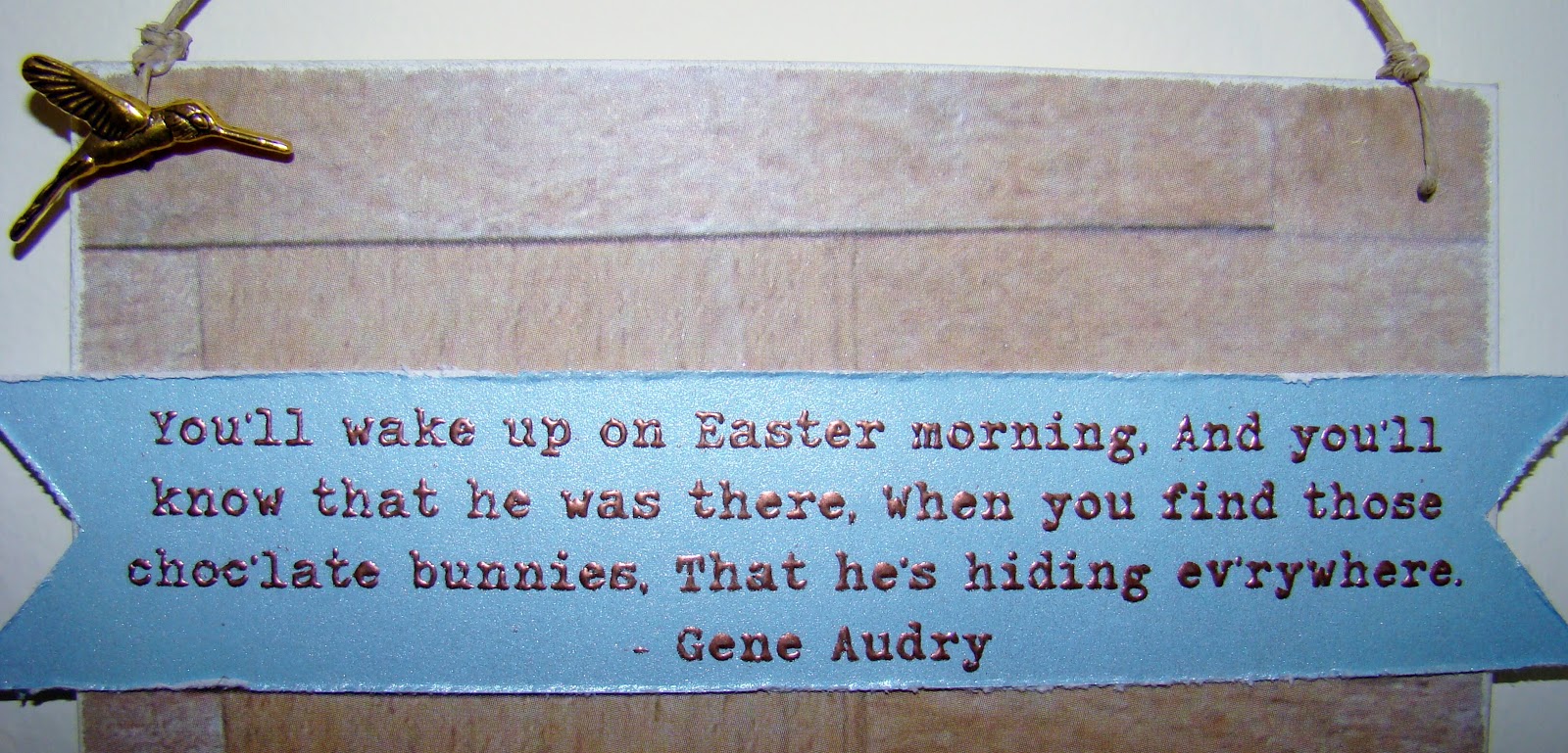
  I found this great sentiment on the Internet by Gene Audrey and thought it fit the sweet retro feel to my sign. I used Traveling Typewriter font and embossed it since the nice shiny DCWV helps the ink from the printer stay nice and wet longer. I love the Blue Moon Beads hummingbird charm :)
 
My grass was cut from the Cricut cartridge, Country Life, p. 73. Since I didn't own any of the kraft core paper, I cut my image twice. One in matte shade of green ( 2.5" RDS ) and the other in a shiny green ( 2." RDS - flipped ) I flipped the image so that the grasses would not line up and give a similar effect to offsetting the cuts like TH did. Then, I inked the edges of the grass using Antique Linen with my blending tool.

The most fun was had when I finally broke open my stash of Distress Paints, ( and yes, I am the proud owner of every single color.) I was giddy with excitement....OK...not really giddy but darn happy! I wanted to make some Easter eggs to along the bottom and thought I'd try a Tye dye egg or 2...or 3. I used the broken china, spun sugar and mowed lawn...yum! ( I did learn that poor spun sugar can be quite overwhelmed by her sister colors so ended up putting extra spun sugar on top of the other colors after they dried. ) Eggs cut from Cricut's, Stretch Your Imagination, p. 67 ( used in CCR to remove the paintbrush )

other products used:
Really Reasonable Ribbon
Helmar - 450
basket weave paper - ( who knows? it's oooooollllldd...and I hooooaaarrrdddd iiiiiit!  And if you know Ron White, the comedian from Blue Collar Comedy, channel his voice when you read that, lol)
Prima - leaves and flowers
 
-----------------------------------------------------------------------------------------------------------------------
 
#15 -  Mother's Day card
 
Kinda came about unintentionally, while looking for a green card stock I found this negative cut that I must have done ages ago. I placed a piece of my sprayed tissue underneath it,
 and then accidently smudged a bit of gesso on it.....darn.....
that's what I get for working on more than one project at a time!
 

 I sat there and looked at it for a moment and then thought, what the heck. Got out more gesso and lightly spread it onto the card, lol Thanks for the Mixed Media Monday gals for helping me pick out a button :)

entering this in Moxie Fab's challenge: Emphasize on the Negative


Thursday, February 7, 2013

lackluster: adjective

lacking in sheen, brilliance, or vitality : dull, mediocre 
 
 
---------------------------------------------------------------------------------------------------------------
entering this in:
 
Tim Holtz - 12 Tags of 2013
( Where I am taking the TH tags and making them into  6x12" wall hangings. )
 
Ranger products used:
Distress Stains - Faded Jeans, Barn Door, Vintage Photo
Distress Markers - Spun Sugar, Broken China, Antique Linen
Tissue Tape
Glossy Accents
 and in
Anything But a Card - Challenge 12 Share The Love
 

I really enjoyed watching the video tutorial that Tim gave showing how to use the Distress markers with the Distress Inks and with using water. It's like having a whole new set of products to play with. I didn't have the stamps he used but found this coloring page to play with. I also made a bow using the tissue tape, love it!

I had a lot of fun making this charm by printing out a heart with the quote, then forming a wire in the heart shape and filling it in with Glossy Accents. I love it...
 but confession time alert:
I purposely left room to write "unknown" on the bottom right corner of the heart but forgot to do it because I was enjoying the whole process too much! lol
 
Really Reasonable Ribbon - twine and heart ribbon
Faber Castell - PITT pen 
Fancy Pants - button
 
clip art that was used:
( feel free to use )
 
The playing card doesn't re size very well, but it's doable :)
---------------------------------------------------------------------------------------------------------------------

I'm having a birthday give away to celebrate getting older...ugh!
But it's always more fun if there are presents involved! right?


Friday, January 4, 2013

festoon: noun

a decorative chain or strip hanging between two points
or
 a carved, molded, or painted ornament representing a decorative chain

"Festoon" traces back (by way of French and Italian) to Latin "festa," the plural of "festum," meaning "festival." "Festa" is also an ancestor of the English noun "feast."
--------------------------------------------------------------------------------------------------------------------------

Being that this is a new year with fresh starts and all has given me the inspiration to do something different with the Timmy Tags of 2013. Instead of making tags, ( which by the way, and don't faint, but I packaged up the 2012 tags and put them in the Art Mob, let's see if they sell? ) I am going to try and make wall hangings instead from the tag challenges..and yes, they will also be put up in the Art Mob. What inspired me you ask to make the tags into wall hangings? So glad you asked, lol You see I went into the store on the 2nd to change out my Christmas stuff to Valentines Day stuff and discovered that I sold 6 wall hangings in December! Like wow, right...exciting but it also puts me into a slight panic mode to fill in those empty spaces!
So here is the first Tim Holtz 2013 tag wall hanging!
 
 
other products used:
Ranger - Distress Stain, Vintage Photo, Clear Rock Candy crackle paint
Tim Holtz Ide-ology Film Strip ribbon
clip art from the Internet - pointing hand, gears
clock hands, gold beads, clip - misc.
Eyelet Outlet - Gear brads ( removed brad parts )
Faber Castell - blue metallic gelato ( rubbed dry onto embossing plate ) and salmon gelota used on clock frame, and PITT Pen,black
Fiskars - bamboo embossing plate
Big Shot
Helmars - 450 and Liquid Scrapdots
Aleenee's Tacky Glue
background words from Helmars Challenge site ( printed in reverse on wax paper and pressed down on board, love this technique! )
Golden - gesso, and gel medium
Cricut - French Manor, p. 31 ( clock face 8" )
Really Reasonable Ribbon - hemp cord ( dyed with Vintage Photo )
ScorPal - tape
 
Also entering this in Helmar's January Challenge where I doubt I can win this month as I won last months December challenge..woo hoo me! lol ( side note, this is one of the signs that sold quickly as it wasn't even in the store for a whole month! I loooooove it when that happens )
This month they want you to use the colors blue and orange, the word LIFE, and a list. I was so inspired by the word art list that I used it on my background. I copied it from their site and put it into my print program, reversed the words, printed it off on wax paper and then laid it down on my board and pressed it down using my hands. Gently lift off the wax sheet, don't let it wiggle or it will smear and then let it dry.
 

 I hope you can see the words:

-----------------------------------------------------------------------------------------------------------------------
OK, does anyone else have problems with the colors in Dylusions Melted Chocolate? For me it comes out beautifully until it dries, gets mixed or spritzed with anything. Here I began my board by gessoing it, let it dry and then I sprayed the Melted Chocolate onto it, added a little bit of Folk Art Turner's Yellow, and spritzed it with water. I took my fancy credit card tool and smoothed out the Melted Chocolate to discover this color reaction, can you see the green and pink? Do you see any brown? lol It's actually very pretty, just not what I was going for!