to make necessary repairs on; restore to serviceable condition
----------------------------------------------------------------------------------------------------------------------
I brought home one of my wall hangings from the Art Mob, intending to tweak it a little bit as I was not happy with it. This is what it looked like when it came home:
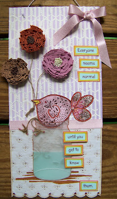
It got a lot more than tweaking, it got a complete overhaul, and now this is what it looks like!
entering this into:
Anything but a Card - Challenge 4, Halloween or Fall Theme, or just Fall Colors
( obviously I chose the Fall colors )


12 comments:
Love it now! What a difference!!!
I think you were right to bring it home and do some tweaking - it already looked lovely but I think your makeover has turned this into something far better! I love the background you created looks like a wall with the last rays of the sun on it. The flowers are really pretty and the ribbon looks like it's floating gently in the breeze - very clever. Great sentiment too.
I'm so glad to see you've entered it at Anything But A Card too! Hope your week is going well so far.
Juliaxx
Hi Sandee, I like your overhaul, very, very much. That brick wall stencil is brilliant and those flowers are gorgeous. Nice job! Crafty hugs, Anne x
just beautiful!!
I love them both, but I extra love the overhaul!
Fabulous alterations with the brick...a contrast of hard and strong meets soft and fragile! I love it! Love the way you did the new sentiment as well! Thanks for the visit! You live in a gorgeous place!
Hi Sandee,
Oh, I loved the little birdie -- I guess it just decided to fly away. The new plaque looks great too. Love the brick work background!
Hugs,
Kay
Wow. What a transformation. Love this version. Hugs Mrs A.
That was more than a makeover. That was a true overhaul. I really like the brick background and the flowers are superb.
I have to say your new old piece is wonderful!!! Glad you made the change!!!
Liked it before. Love it now! :)
Hiya Sandee
I was just looking at a cricut magazine in the electronic library of Northridge Publishers (I have an account) and I saw your butterfly tag project in there and it linked me back to you - who I was coming to visit anyway! lol. Well done for being published.
Great project on your desk - nothing like a bit of colouring is there. I managed to have a good peek round by zooming right into the picture - amazing how much more you get to see... that wine bottle neck looks a bit suggestive! lol.
Hapy WOYWW
Paula x x x (#21)
Post a Comment